DeElectronics Arena Brand Identity
Developing a dynamic and trustworthy brand identity for DeElectronics Arena, a modern retail brand specializing in consumer electronics.
Brand Overview: DeElectronics Arena
DeElectronics Arena is a contemporary retail brand dedicated to providing a wide range of consumer electronics. Its mission is to connect customers with innovative technology, offering reliable products and exceptional service. DeElectronics Arena aims to be the go-to destination for tech enthusiasts and everyday consumers alike, emphasizing quality, accessibility, and a seamless shopping experience.


Visual Identity Showcase
A deep dive into the core elements that define the DeElectronics Arena brand, from its distinctive logo to its vibrant color palette and dynamic visual language.
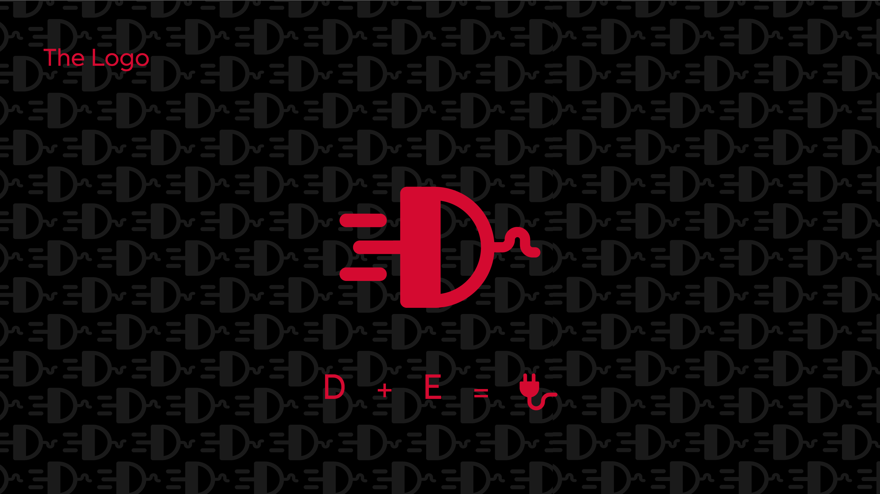
The DeElectronics Logo
The DeElectronics logo cleverly integrates the letters 'D' and 'E' to form a stylized electrical plug, symbolizing connection, power, and the brand's core business in electronics. Its bold design is memorable and instantly recognizable.
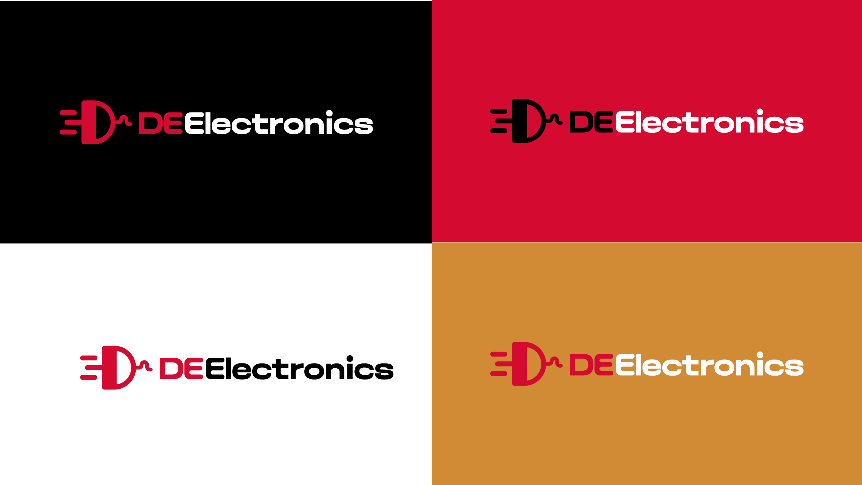
Logo Variations
The logo is designed for versatility, appearing effectively across various backgrounds and applications while maintaining its strong visual impact.
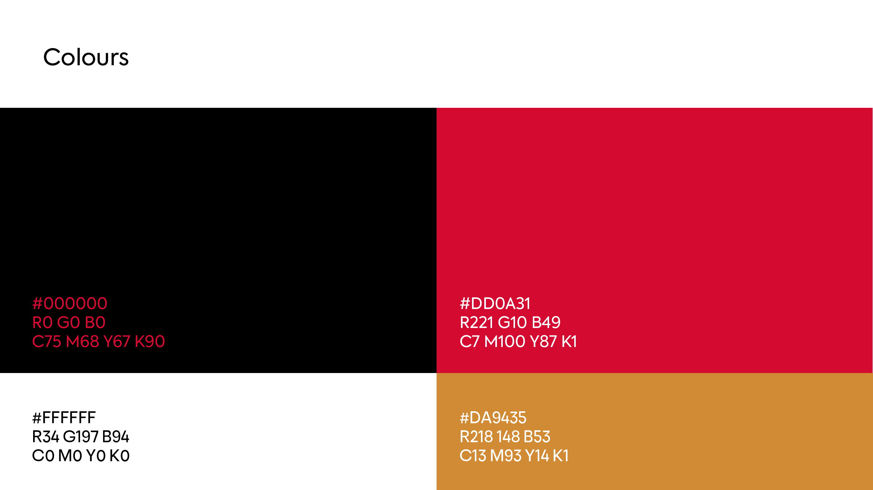
Color Palette
The primary red signifies energy, passion, and innovation, while black adds sophistication and a modern edge. White ensures clarity and contrast, and a warm gold accent provides a touch of premium quality.
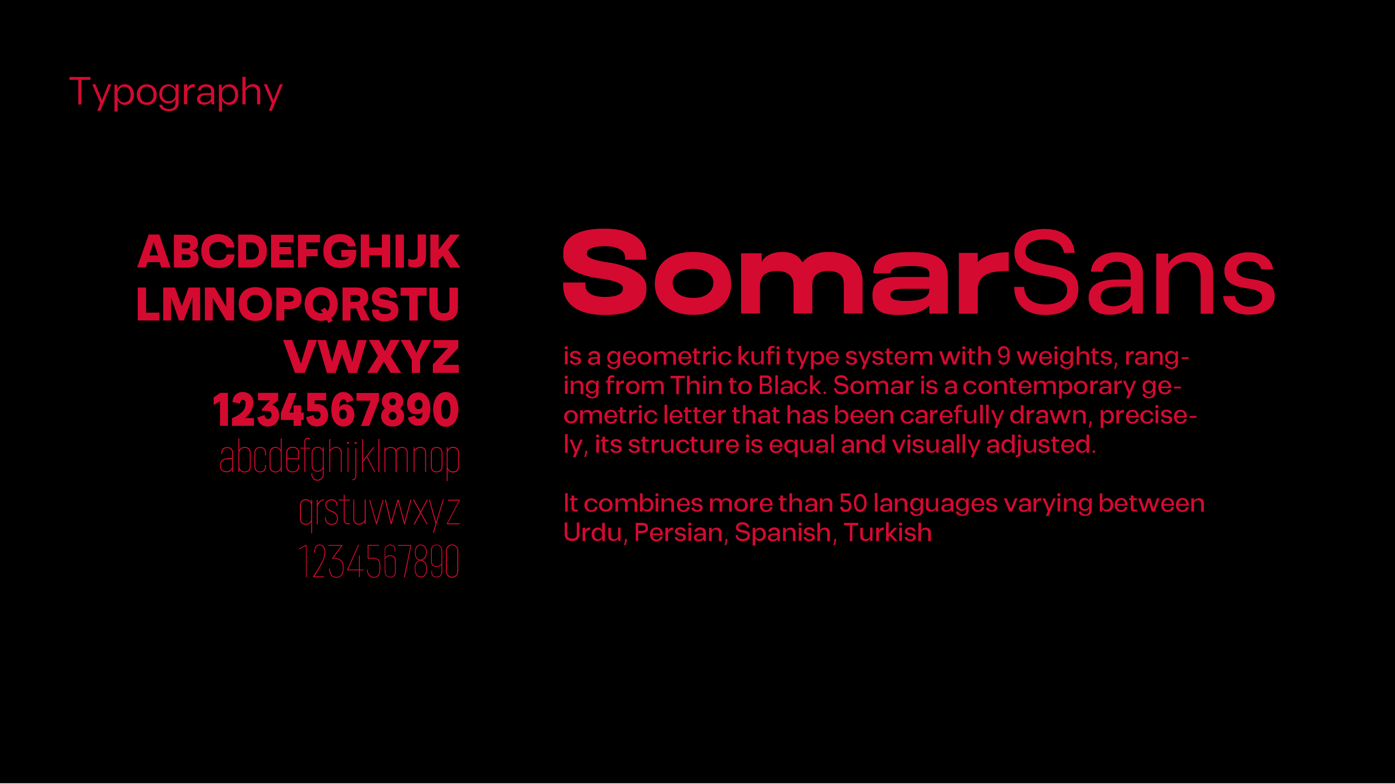
Typography
SomarSans, a geometric Kufi type system, was chosen for its modern, clean aesthetic and excellent readability. It balances professionalism with a contemporary feel, suitable for a tech brand.
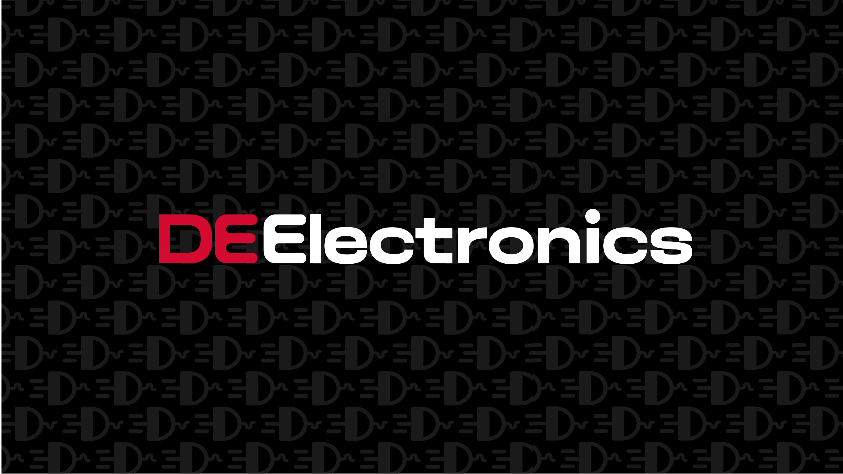
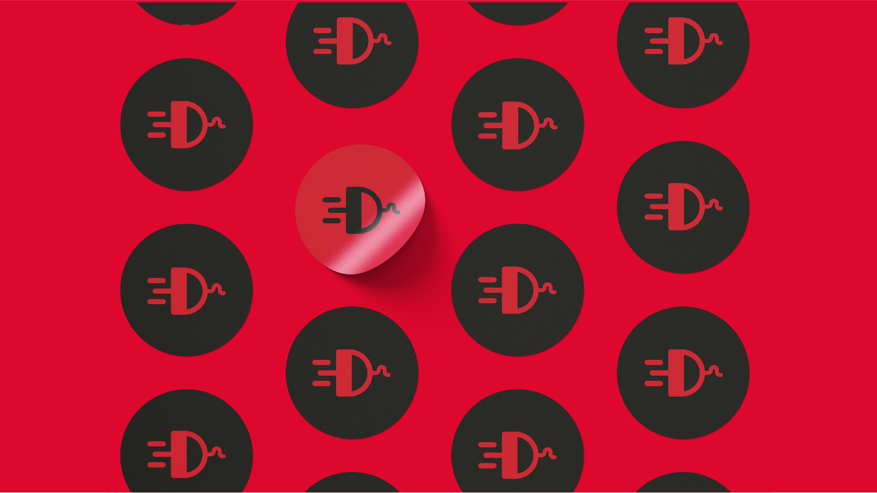
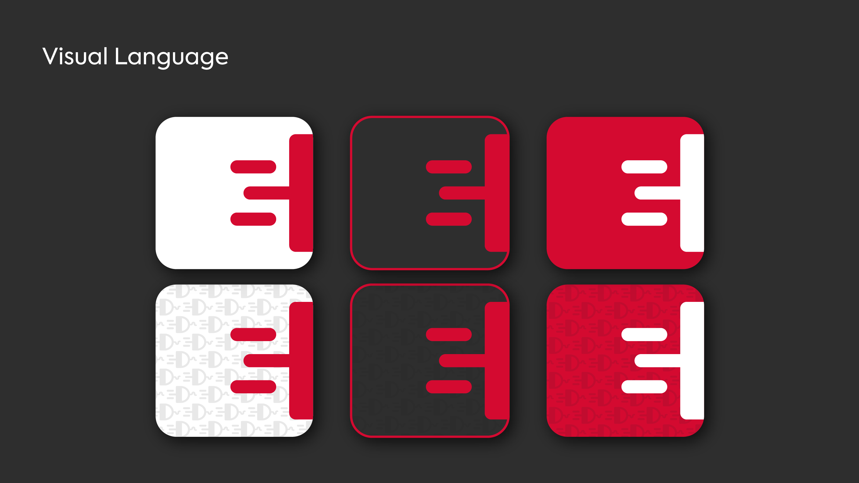
Visual Language & Patterns
The repeating plug icon forms a subtle yet distinctive pattern, reinforcing the brand's identity and creating a cohesive visual texture across various applications.
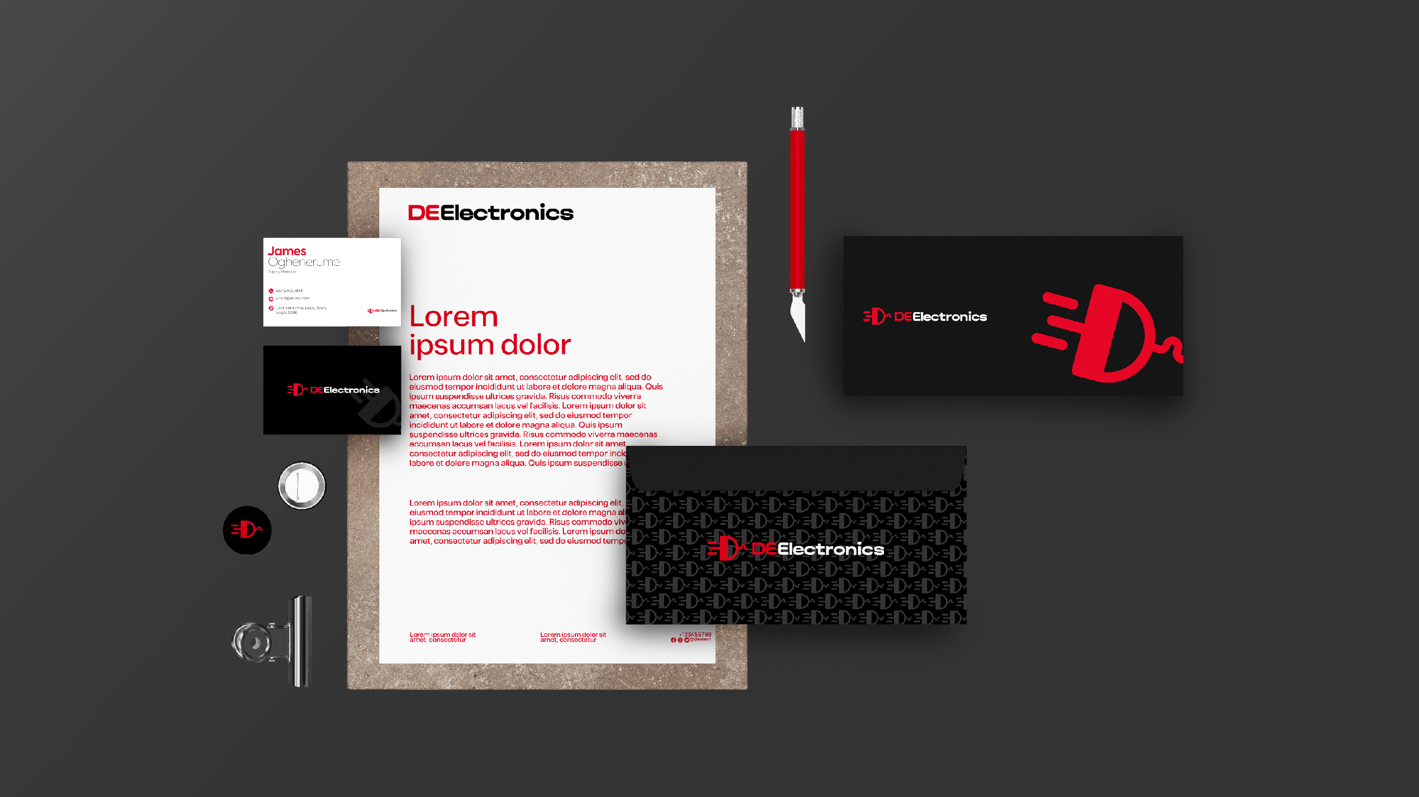
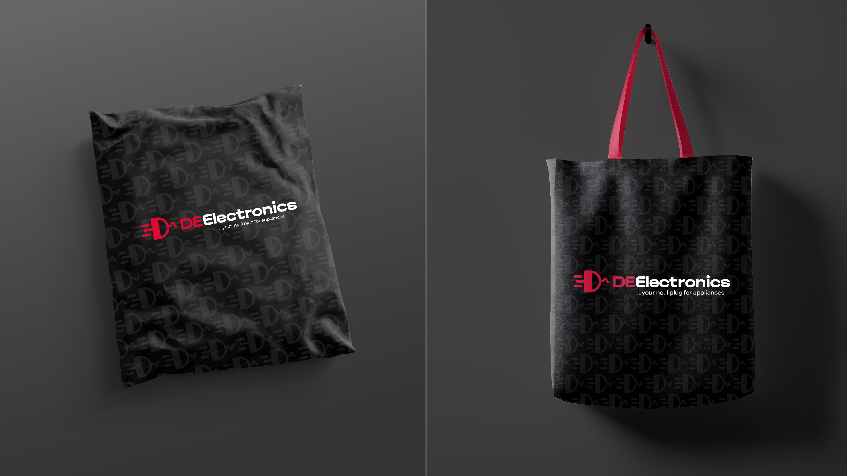
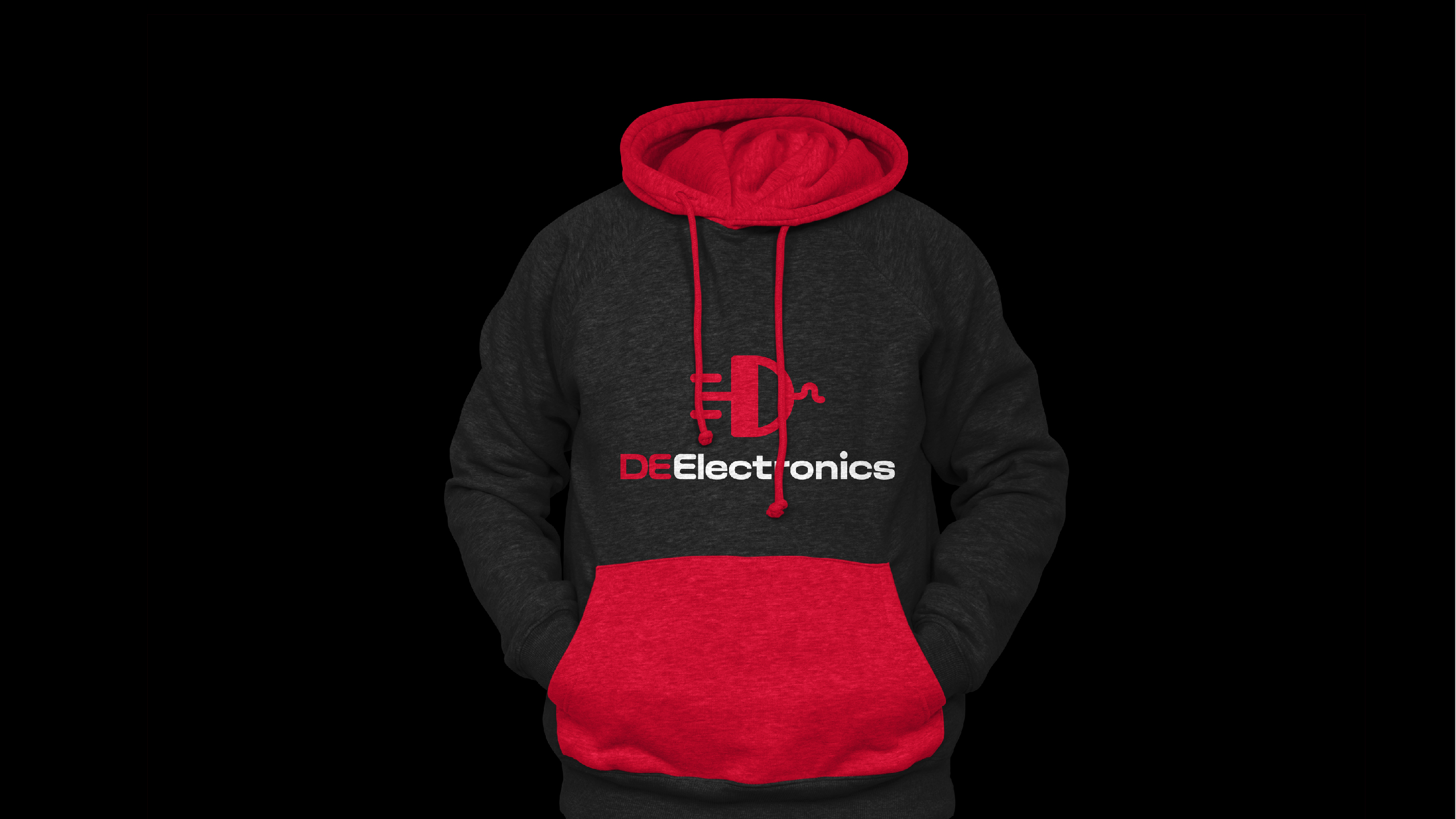
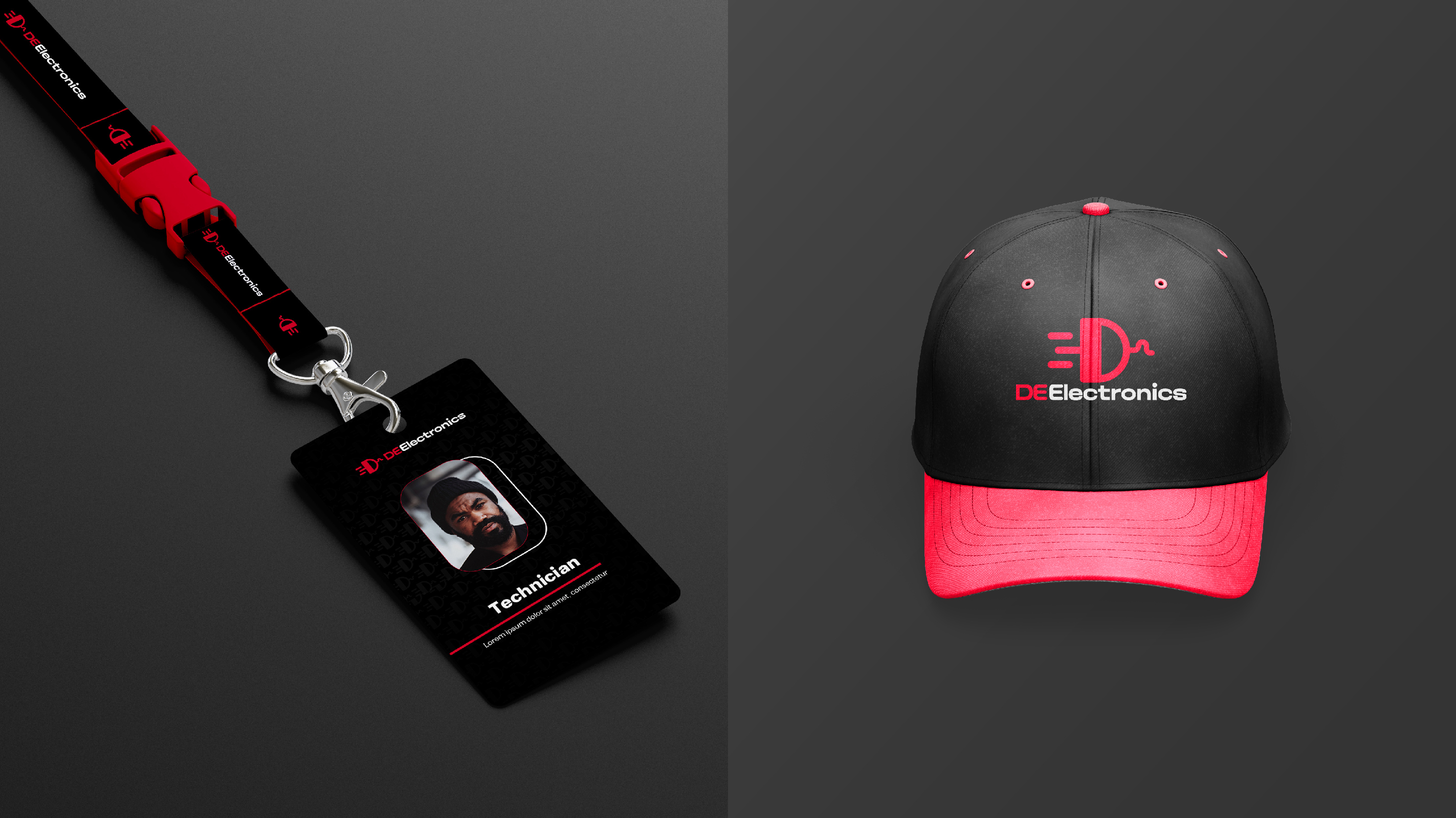
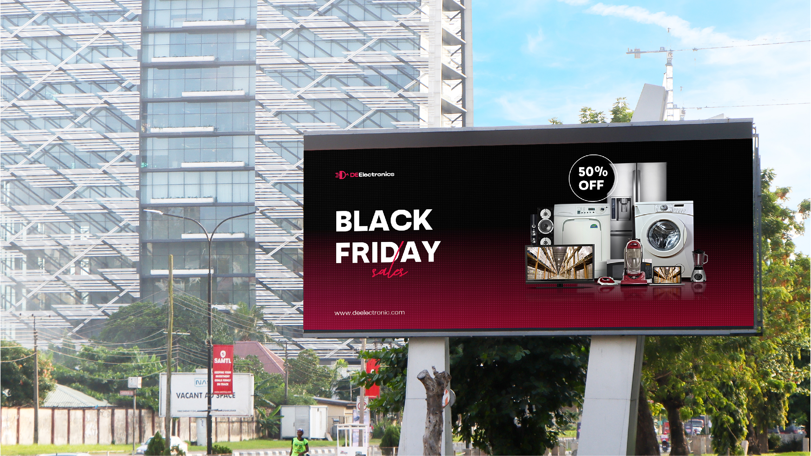
Brand Applications in Action
See how the DeElectronics Arena brand identity comes to life across various digital and physical touchpoints.
Our Design Process
Our design process for DeElectronics Arena began with a deep dive into the electronics retail market and the brand's aspirations. We conducted thorough research into competitor branding and consumer expectations for a modern tech retailer.
Using **Adobe Illustrator** for precise vector logo creation and **Adobe Photoshop** for realistic mockups and visual asset development, we iteratively refined concepts. Key design considerations included creating a logo that was both innovative and clearly communicated the electronics focus, a color palette that felt energetic yet trustworthy, and a typography system that was clean and highly legible across all digital and print mediums. The visual identity was crafted to appeal to a broad audience, from tech enthusiasts to everyday consumers, emphasizing reliability and a forward-thinking approach.
- Market Research & Analysis: Understanding the electronics retail landscape.
- Concept Ideation: Sketching and digital exploration for logo and visual elements.
- Iterative Refinement: Polishing designs based on feedback and brand strategy.
- Application & Guidelines: Developing a comprehensive brand system for consistent use.
Project Goals
The primary objectives for the DeElectronics Arena brand identity project were to:
- Establish a modern, innovative, and trustworthy brand image in the electronics sector.
- Create a memorable and distinctive logo that clearly communicates the brand's focus.
- Develop a versatile visual system adaptable across digital, print, and retail environments.
- Enhance brand recognition and appeal to a broad customer base.
Key Deliverables
The project resulted in a comprehensive set of brand assets designed to equip DeElectronics Arena with a strong visual foundation:
- Primary and Secondary Logo Variations (vector and raster formats).
- Detailed Brand Guidelines Document (including logo usage, color palette, typography, and visual language).
- Full Color Palette with specifications (CMYK, RGB, Hex).
- Typography System with font files and usage rules.
- Visual Language Elements and Patterns.
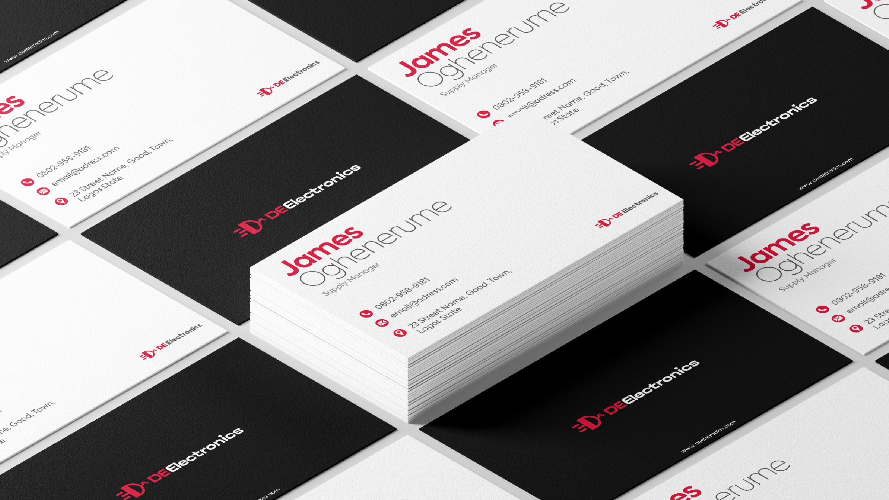
- Stationery Design (Business Cards, Letterhead, Envelopes).
- Packaging Design (Shopping Bags, Product Pouches).
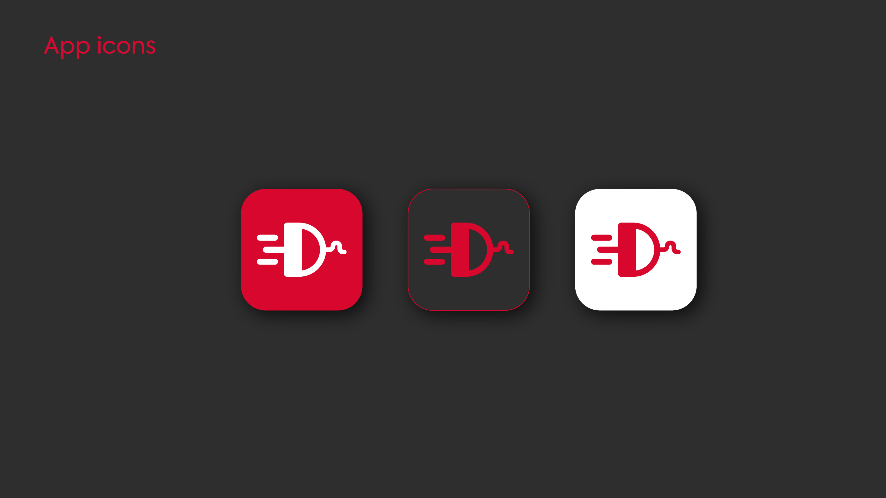
- Digital Assets (App Icons, Social Media Graphics).
Impact & Outcomes
The new visual identity has significantly elevated DeElectronics Arena's brand perception and market positioning.
Brand Recognition
Market Presence
"The new brand identity successfully positioned DeElectronics Arena as a modern, reliable, and engaging electronics retailer. The distinctive logo and vibrant color palette enhanced brand recognition and recall, leading to increased customer engagement and a stronger market presence. The cohesive visual system ensures a consistent and professional brand experience across all retail and marketing channels." - The cohesive and professional branding has enabled DeElectronics Arena to attract and engage its target audience more effectively, reinforcing its commitment to providing reliable and innovative electronics solutions.
Ready to Power Your Brand's Visual Story?
Let's discuss how our design expertise can create a powerful and memorable identity for your brand.